碎碎念
编程语言
R
ggplot 基础
ggplot 基础
ggplot2 基础结构
ggplot 的语法基于 图形语法 (Grammar of Graphics):
ggplot(data, aes(x, y)) + geom_xxx() + ... data:数据集aes():映射(x 轴、y 轴、颜色、大小、形状等geom_xxx():几何对象(点、线、柱状图……)+:叠加图层
先加载示例数据
library(ggplot2)

data(mtcars)
head(mtcars)
## mpg cyl disp hp drat wt qsec vs am gear carb
## Mazda RX4 21.0 6 160 110 3.90 2.620 16.46 0 1 4 4
## Mazda RX4 Wag 21.0 6 160 110 3.90 2.875 17.02 0 1 4 4
## Datsun 710 22.8 4 108 93 3.85 2.320 18.61 1 1 4 1
## Hornet 4 Drive 21.4 6 258 110 3.08 3.215 19.44 1 0 3 1
## Hornet Sportabout 18.7 8 360 175 3.15 3.440 17.02 0 0 3 2
## Valiant 18.1 6 225 105 2.76 3.460 20.22 1 0 3 1
基础图形
散点图
ggplot(mtcars, aes(x = wt, y = mpg)) +
  geom_point()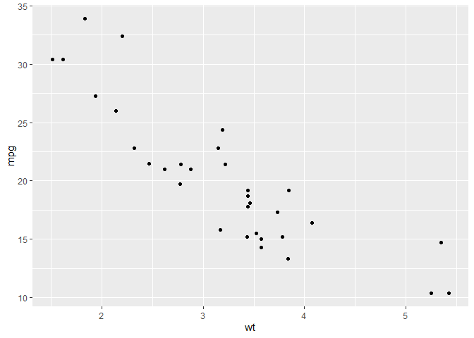
颜色、大小映射
ggplot(mtcars, aes(x = wt, y = mpg, color = factor(cyl), size = hp)) +
  geom_point()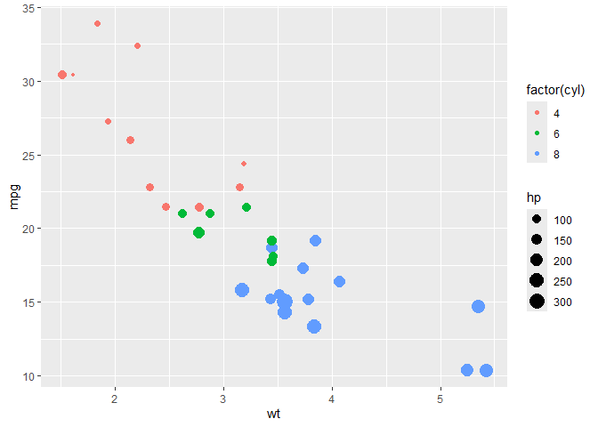
factor()基于…分类
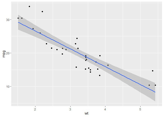
回归线
ggplot(mtcars, aes(x = wt, y = mpg)) +
  geom_point() +
  geom_smooth(method = "lm")   # 线性回归线,lm 指平滑曲线
## `geom_smooth()` using formula = 'y ~ x'
折线图
基本
sales <- data.frame(
  month = 1:12,
  value = c(120, 135, 150, 160, 145, 180, 200, 190, 210, 220, 230, 240)
)

ggplot(sales, aes(x = month, y = value)) +
  geom_line(color = "steelblue") +
  geom_point(color = "steelblue", size = 2)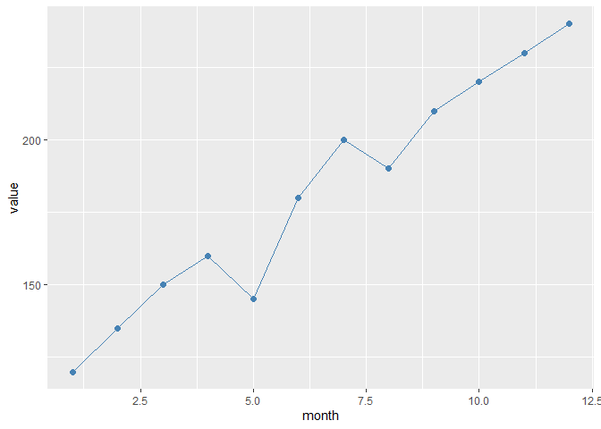
多组
sales2 <- data.frame(
  month = rep(1:12, 2),
  value = c(
    c(120, 135, 150, 160, 145, 180, 200, 190, 210, 220, 230, 240),  # 部门A
    c(100, 115, 130, 140, 135, 150, 170, 175, 190, 195, 205, 215)   # 部门B
  ),
  dept = rep(c("A", "B"), each = 12)
)

ggplot(sales2, aes(x = month, y = value, color = dept)) +
  geom_line(size = 1.2) +
  geom_point()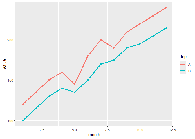
日期 (会自动优化程序包)
library(lubridate)

sales_date <- data.frame(
  date = seq(as.Date("2023-01-01"), by = "month", length.out = 12),
  value = c(120, 135, 150, 160, 145, 180, 200, 190, 210, 220, 230, 240)
)

ggplot(sales_date, aes(x = date, y = value)) +
  geom_line(color = "darkgreen") +
  geom_point(size = 2)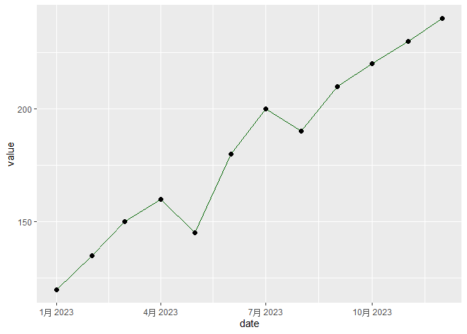
平滑线
ggplot(sales2, aes(x = month, y = value, color = dept)) +
  geom_point() +
  geom_smooth(se = FALSE)   # 默认用 loess 平滑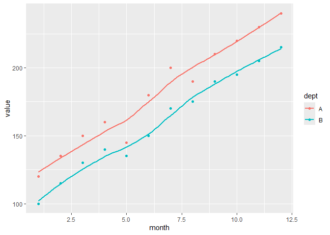
柱状 / 条形图
基本版(计数的)
ggplot(mtcars, aes(x = factor(cyl))) +
  geom_bar(fill = "steelblue")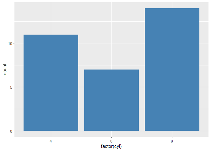
横向
ggplot(mtcars, aes(x = factor(cyl))) +
  geom_bar(fill = "orange") +
  coord_flip()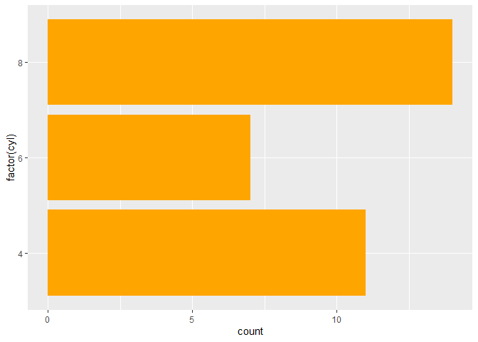
直接使用值
sales_sum <- data.frame(
  dept = c("A", "B", "C"),
  revenue = c(120, 150, 100)
)

ggplot(sales_sum, aes(x = dept, y = revenue)) +
  geom_col(fill = "darkgreen")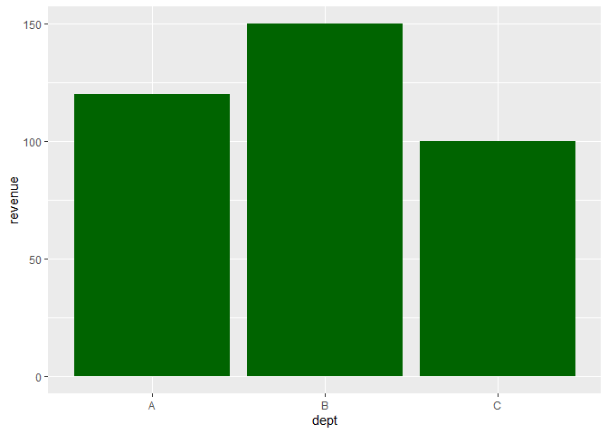
平均值
ggplot(mtcars, aes(x = factor(cyl), y = mpg)) +
  stat_summary(fun = mean, geom = "bar")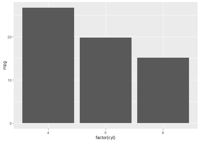
分组柱状图
sales_quarter <- data.frame(
  dept = rep(c("A", "B"), each = 4),
  quarter = rep(paste0("Q", 1:4), 2),
  revenue = c(120, 135, 150, 160, 100, 115, 130, 140)
)

ggplot(sales_quarter, aes(x = quarter, y = revenue, fill = dept)) +
  geom_col(position = "dodge")  # 并排柱状图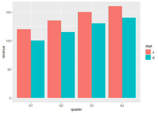
堆叠柱状图
ggplot(sales_quarter, aes(x = quarter, y = revenue, fill = dept)) +
  geom_col(position = "stack")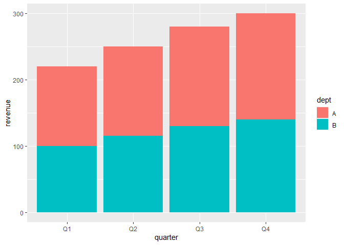
百分比柱状图
ggplot(sales_quarter, aes(x = quarter, y = revenue, fill = dept)) +
  geom_col(position = "fill")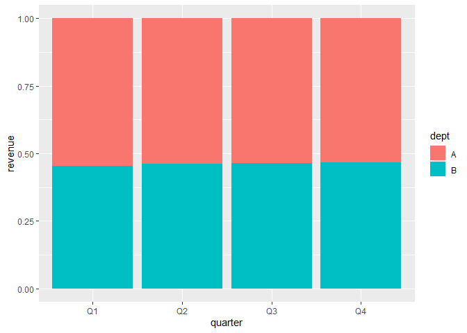
箱线图
基本
ggplot(mtcars, aes(x = factor(cyl), y = mpg)) +
  geom_boxplot(fill = "skyblue")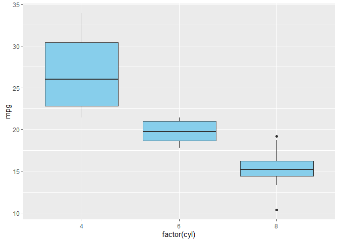
ggplot(mtcars, aes(x = factor(cyl), y = mpg)) +
  geom_boxplot(fill = "lightgray") +
  geom_jitter(width = 0.2, color = "red", alpha = 0.6)  # 点稍微错开一些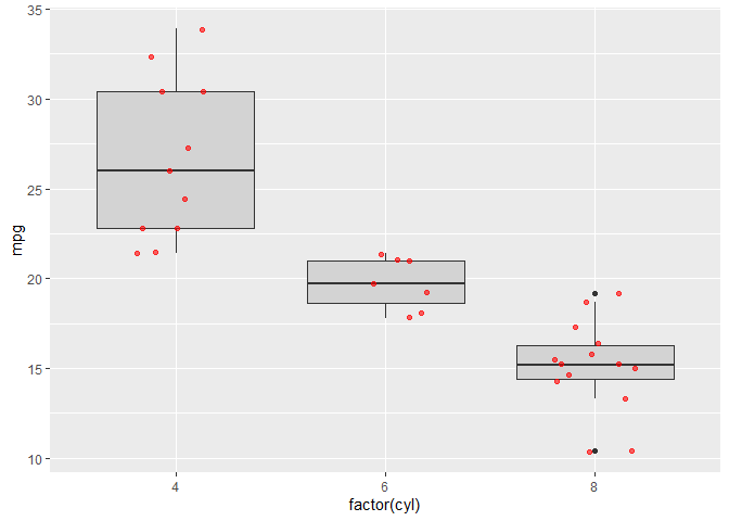
水平箱线图 (改 factor 为 y)
ggplot(mtcars, aes(x = mpg, y = factor(cyl))) +
  geom_boxplot(fill = "lightgreen")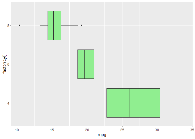
小提琴图
基本
ggplot(mtcars, aes(x = factor(cyl), y = mpg)) +
  geom_violin(fill = "lightpink")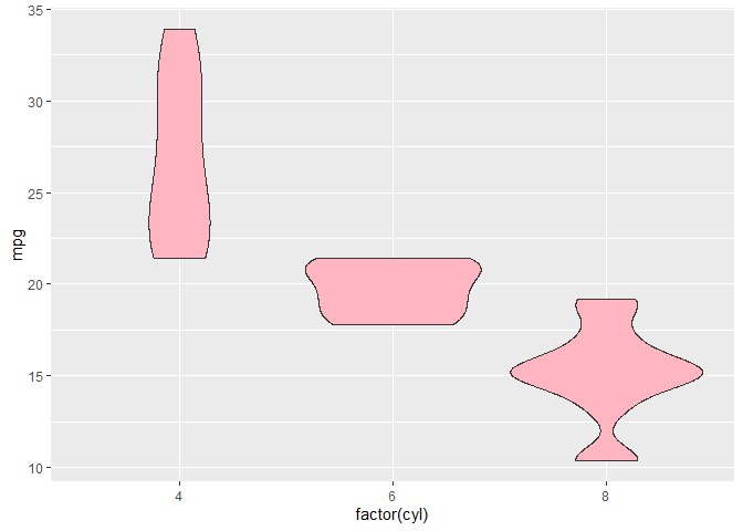
加上箱线图
ggplot(mtcars, aes(x = factor(cyl), y = mpg)) +
  geom_violin(fill = "lightblue", alpha = 0.6) +
  geom_boxplot(width = 0.2, fill = "white")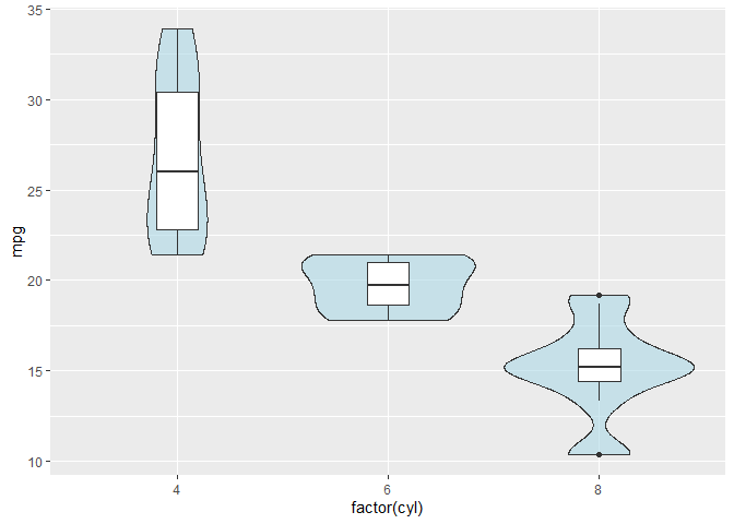
加散点
ggplot(mtcars, aes(x = factor(cyl), y = mpg)) +
  geom_violin(fill = "lightyellow", alpha = 0.7) +
  geom_jitter(width = 0.2, size = 2, alpha = 0.6, color = "darkred")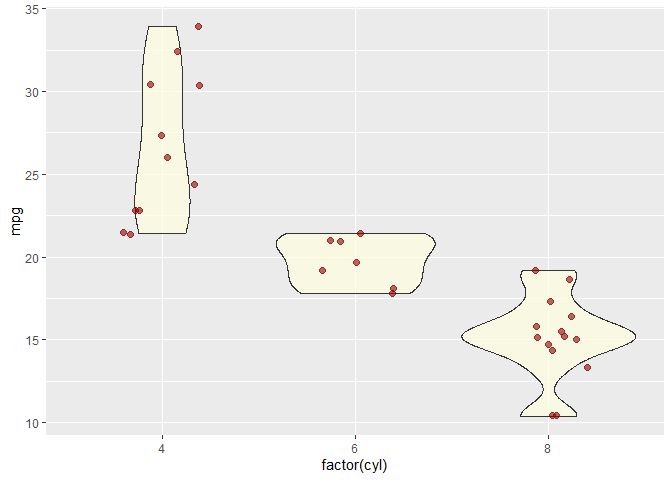
直方图
ggplot(mtcars, aes(x = mpg)) +
  geom_histogram(binwidth = 2, fill = "skyblue", color = "black")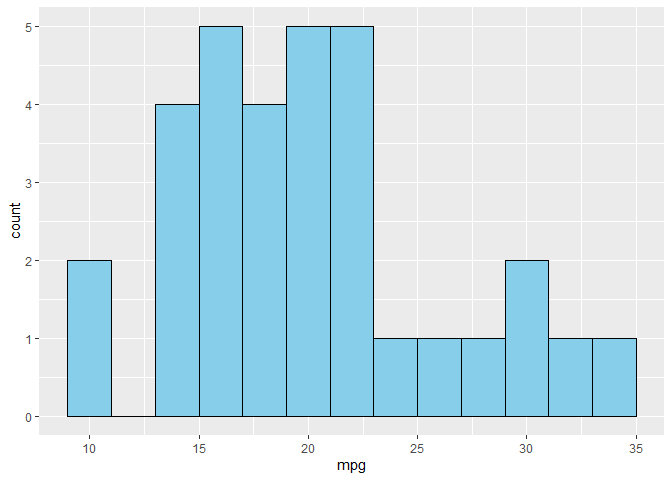
密度图
ggplot(mtcars, aes(x = mpg)) +
  geom_density(fill = "lightgreen", alpha = 0.6)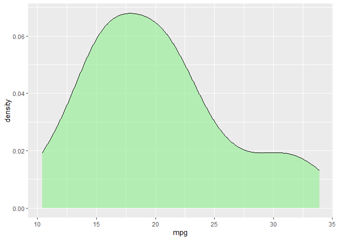
面积图
library(dplyr)

sales <- data.frame(
  month = 1:12,
  value = c(100, 120, 150, 160, 180, 200, 220, 210, 230, 240, 260, 280)
)

ggplot(sales, aes(x = month, y = value)) +
  geom_area(fill = "lightblue", alpha = 0.6)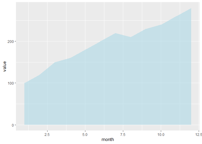
热力图
df <- expand.grid(x = 1:10, y = 1:10)
df$z <- runif(100, 1, 20)

ggplot(df, aes(x, y, fill = z)) +
  geom_tile()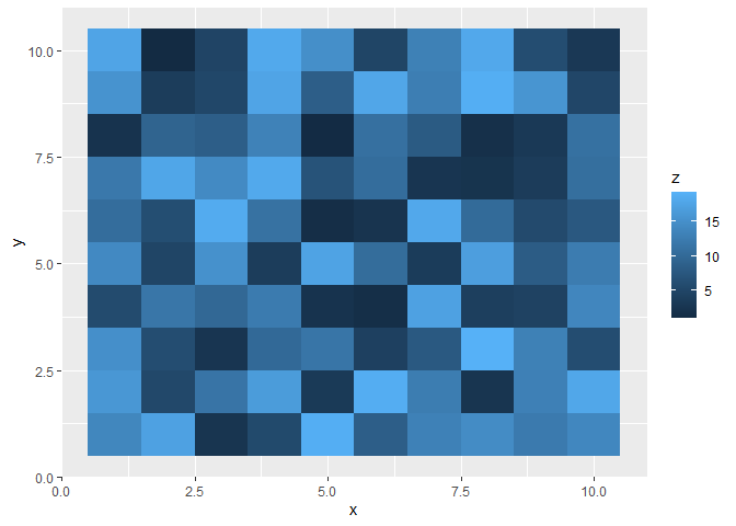
饼图 (geom_bar + coord_polar)
df <- data.frame(
  category = c("A", "B", "C"),
  value = c(30, 45, 25)
)

ggplot(df, aes(x = "", y = value, fill = category)) +
  geom_col(width = 1) +
  coord_polar(theta = "y")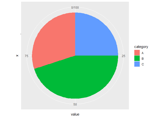
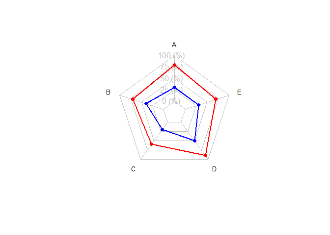
雷达图
使用 fmsb
library(fmsb)

# 准备数据:第一行 = 最大值,第二行 = 最小值
df <- data.frame(
  A = c(10, 0, 8, 3),
  B = c(10, 0, 7, 4),
  C = c(10, 0, 6, 2),
  D = c(10, 0, 9, 5),
  E = c(10, 0, 7, 3)
)

# 画雷达图
radarchart(df,
           axistype = 1,
           pcol = c("red", "blue"),
           plwd = 2,
           plty = 1,
           cglcol = "grey", cglty = 1, axislabcol = "grey",
           vlcex = 0.8)